Role: Primary UX
Core Team: Product Managers, Visual Designer, UX Director, CEO
Key Performance Indicator: Increase web traffic to treatment description pages
Testing: A/B testing individual elements during incremental rollout
The RealSelf website is dependent on Google for user traffic. For that reason, our primary investment was more often on SEO and converting users from each individual page. In an effort to reduce our bounce rate and shift our focus toward a full-service experience, we needed a major shake-up.
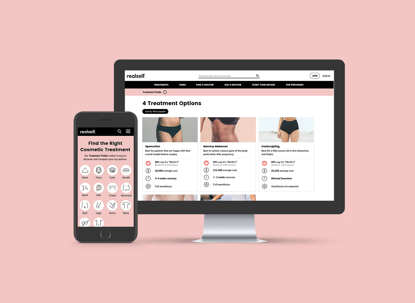
The first step in this journey was thinking about our treatment discovery experience. Where do our users begin when thinking about treatment options?
Research & Observations:
Users trust RealSelf guidance and suggestions
Body part options have the highest interaction rate when narrowing down treatment options
We knew that we should start by giving users body part options to get them engaged in the finder. However, there was a spirited debate around whether this should be a more utilitarian filter or a guided wizard.
Ultimately, we couldn’t argue with the data from previous tests. Users were more likely to engage with wizards than filters. In addition, we knew that our users trusted RealSelf, so we used this as an opportunity to build our brand voice with an immersive full screen wizard.


