Role: Primary UX/UI
Core Team: UX Lead, UX Director, Copywriter
Key Performance Indicator: Interaction with ‘Buy Now’ CTA, scroll depth
As a flagship product, the M8 introduced new technology and features that were crucial to setting HTC apart from the competition. From a UX standpoint, we had to ask ourselves, 'How can we ensure our users understand what makes this product unique?'.
Historically, our analytics have shown that users don't make extra clicks to learn about individual features. The previous version of this page gave users too many options and not enough context.
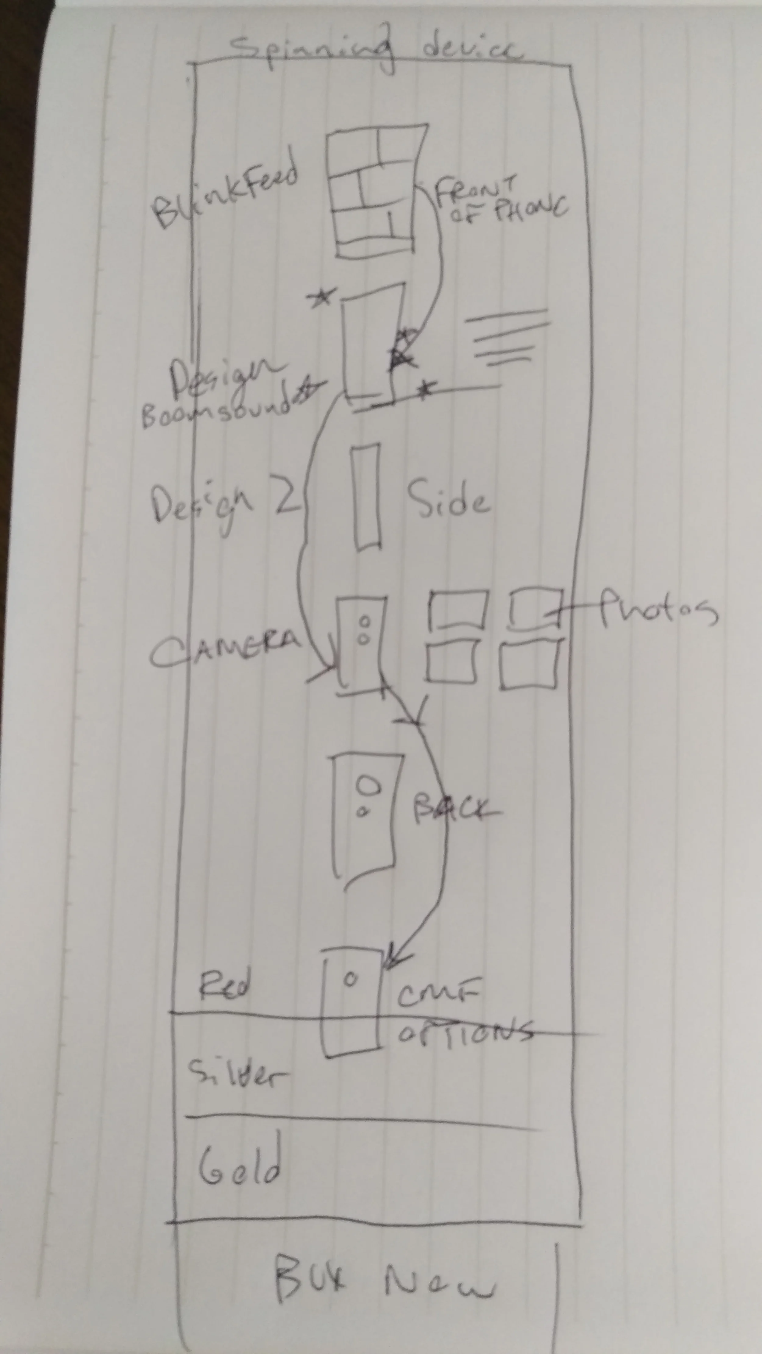
Quick Sketches
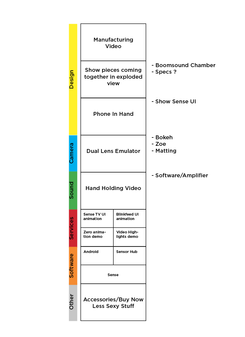
Wireframes
It became clear that we needed to immerse our users in each M8 feature. Instead of overwhelming them with choices, we needed to guide them through a series of curated content. I narrowed down the options with mid-fidelity wireframes.
These two new concepts were tested against the existing site product detail page. The results were clear, users loved the full bleed imagery and video.
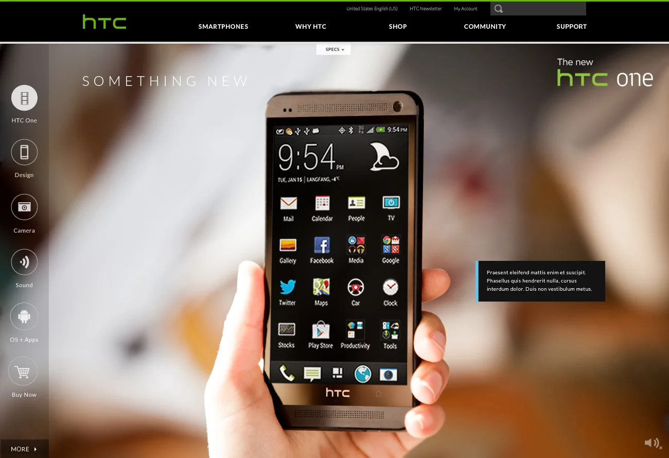
UI Iterations
User testing also revealed that our concepts were lacking in lifestyle imagery. Seeing the device in a lifestyle context was very important to our demographic–something we took into consideration for our content plan.


