Role: Primary UX
Core Team: Product Manager, 3rd Party User Research Agency
Key Performance Indicator: Increase app on-boarding completion rate
Testing: A/B testing against previous flow
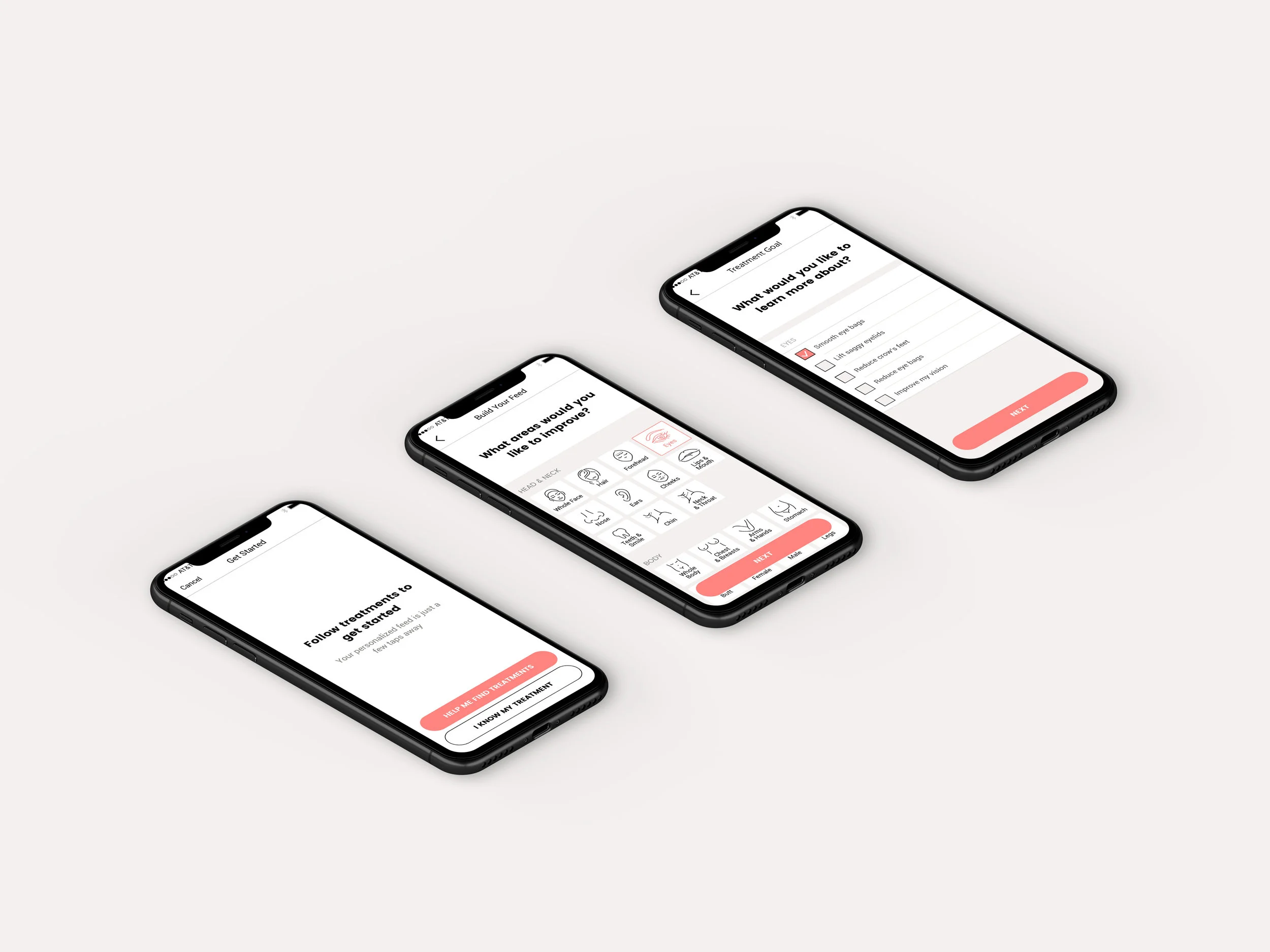
The RealSelf app is primarily a feed displaying curated content. In order to capture a user’s interest, we need them to complete an on-boarding flow where they can explore treatment goals, learn about treatment options, and then select treatments to follow.
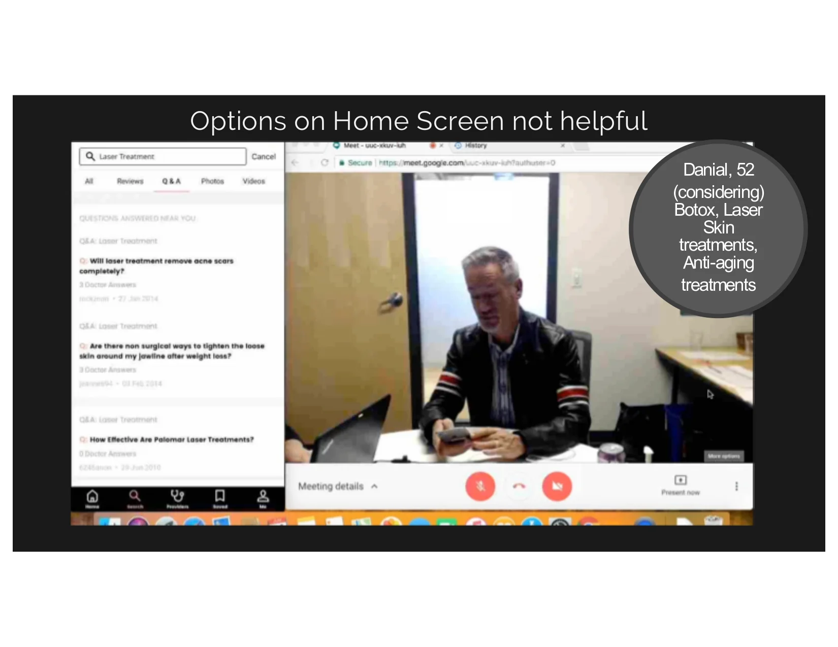
We had been hovering at a 52% on-boarding completion rate, so we enlisted the help of a user research agency for an in-depth usability study.
Key Takeaways:
After a user completes on-boarding, we need to play back their choices in a very clear way
Treatment information needs to be more discoverable
We should educate users on what they will be getting when they complete this flow
We hypothesized that adding two screens to the flow would give users enough context to complete on-boarding.
In addition, we also made it easier to learn more about treatments within the flow or after completing.
Results:
In the end, we successfully increased on-boarding completion to 93% while still allowing users to opt out if they chose to skip it.


